Monday, July 26, 2010

The Vote is In--Cherry Cobbler it is!!

I held my New Catalog Open House last Friday, and as usual I had two projects out for everyone to do. As usual, narrowing down which items from the new catalog I would use was the hardest part of all the prep. All the new colors, all the new sets, ALL the new bling!!! It was REALLY hard, but about 3 days before the Open House (I know, a lot of you are saying, "Three days! Not the usual 3 hours???" Amazing, huh?) I simply bit the bullet, made myself choose a couple colors and a couple sets and got busy!


This first project had everyone ooohing and aaahing over the new Cherry Cobbler cardstock. It's my new top pick too. (It took awhile for the light bulb to come on--of course I love this color! My car is this color, my laptop is this color, my phone is this color. . . . Duh!)

It's a pretty simple design, but it incorporates the concept of "white on a white mat," something that I would have never thought of, but I loved the way it looked on a sample I saw. The sample was a very colorful card, but here the Cherry Cobbler is bold enough to make the idea work all by itself. The stamped foliage (from the new "Just Believe" stamp set) cardstock piece is adhered to the mat with Dimensionals to really make it pop.

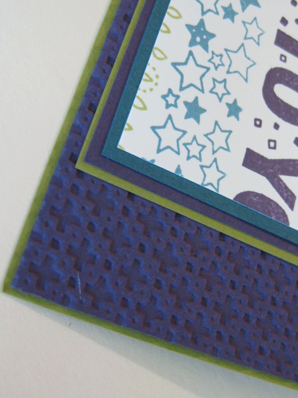
This project also uses the "Happy Birthday" from the new "Perfect Punches" stamp set as well as the new self-adhesive Pearls and the "Vintage Wallpaper" embossing folder to use in the Big Shot. At first glance I wasn't sure this folder design was going to be something I liked because it seemed a bit "chunky" for my taste, but then I turned my embossed piece over and I was in love! That's the great thing about these folders--it's like two folders in one! If you look closely at the samples below, you can see that the design in first one is raised (typically called "embossed") and in the second one, the design is "sunken" ("debossed").


I used the "debossed" version for my card because the look seemed more subtle and appropriate for this design.

The second Open House project uses the new "Morning Cup" stamp set, my current favorite new set. I wanted to share an additional way to use the clear mount blocks and the scale of this set was perfect!

If you take a look at the "shadow" surrounding the tea cups or percolator, you might notice that we don't really have a stamp like that. BUT if you take the clear "C" block, stamp it on the Marina Mist stamp pad (just the block, with no stamp attached!), stamp the block off on scrap paper once, and then go to your cardstock to stamp the shadow, that's the image you'll get! Kinda cool, huh?

The base of this card is "Crumb Cake" (formerly known as Kraft), and the mat behind the center image is Marina Mist. This project also uses the Dotted Scallop Ribbon punch and Marina Mist taffeta ribbon in the new 1/8" variety. The images were colored in with Blender Pen and markers (Marina Mist, Real Red, Pumpkin Pie, and Always Artichoke). Everyone chose the stamps they liked and whether to use Pumpkin or Red with the punch. The inside of the card got a bit of embellishment courtesy of the coordinating "Take a Sip" wheel, a collection of coffee mugs and tea cups.

I know both the stamp set and wheel are going to get lots of personal attention from me. The images are so cheery and comforting at the same time. And as I'm rarely more than an arm's length away from my main vice, it's perfect! Speaking of which, it's time for a refill!! Hope you get some stamping time in this week!

>

Monday, July 19, 2010

That "New" Demo Feeling. . .

Little by little, I'm getting to all the areas in my craft room that need to be switched over to the new Stampin' Up! Color Collections. When I finally made a list (so I could feel like I was making some progress!), all the areas that needed an overhaul were pretty amazing. Cardstock, pads, markers, cartridges, spots, reinkers, ribbons, embellishments. . . . No wonder I was feeling a little overwhelmed!

Of course, someone who shall not be named who lives under this same roof might make the comment that if I didn't have so much stuff, there wouldn't be. . . . Yeah, yeah, we're not even going to go there, Mr. I-have-so-many-different-electronic-gizmos-I-don't-know-which-cable-is-which! It's MY stuff and I NEED ALL OF IT!

So anyway, back to the project. As I've been working on swaps and things, I've found myself floundering a bit, not knowing quite where a particular color belongs. Is Regal Rose really a "Bright" now? Then shouldn't we rename it "Bright Rose?" I feel like I did when I was brand new to Stampin' Up! Back then I had everything labeled BB, SS, RR, or EE, depending on which color family it belonged to, and here, 10 years later, I'm finding that I need to do the exact same thing so that I can learn that my ol' EE friend, Old Olive, is now a Brights guy.

I started with my ink pad collection, making labels for the ends of the pads on the computer. There are numerous ways to organize these things, but I decided that I would store my pads and markers in their color collections, alphabetically by color name. Brights pads are on the first two shelves, Neutrals on the next two, then Subtles and Regals.


When I typed out the labels, I had to also include the name of the collection so I will keep everything straight while I adjust to the new system. I also penned in a letter and number to help keep them in alphabetical order. I know, a bit much, but my brain seems to need this much organization.


My markers, despite several color updates over the years, have always lived in my original marker box, the one with the insert that has the colors listed on the side rather than the back of the box like they are now. I can see it from my desk chair and I'm used to it. Of course it was a major pain to re-do this because I needed to cut samples of each color and stick them to the box, but the now-retired triple arrow punch actually made this a little easier. One of the arrow parts was the exact width I needed. I did this over the course of a few days, so it didn't get too tedious.


When I went through my ink cartridges, I was really surprised at how many cartridges I had in colors that were no longer current. I saved a lot of them, but there were a few that I knew I'd probably never need again, so it was off to the kitchen sink for them! Ten minutes under a stream of cold water (or until the water coming out of the cartridge runs clear), paper towel and some drying time, and voila! Cartridges ready for a new life!!

I've been doing this for a number of years because I'd much rather buy a new stamp set or another roll of ribbon than a new ink cartridge. It works very well! I just make sure to grab a "pre-used" cartridge of similar color, in case there's some residual ink in there. I don't think I'd grab a previously-red cartridge and plan on putting a blue or green in there, but one of those cartridges in the picture was probably Forest Foliage in its previous life, and it's just waiting to become Wild Wasabi or maybe Early Espresso.

So anyway, that's what I've been doing to fill up any spare time I might find. (I'm also unmounting a some retired stamp sets, but that's a story for another day.) As usual, there are all sorts of projects going on here. Melissa's having a party for her 16th birthday, I'm prepping for my New Catalog Open House this coming Friday (11 AM-7PM--if you're in the area, please stop in!) and we just finished several weeks of involvement with the musical our high school puts on every summer.

I got to "play" a bit while wrapping the gift cards for the directors of the play, making some boxes out of cardstock I decorated using My Digital Studio. The boxes look like they've been wrapped with Designer Series Paper, but because I wanted the boxes to be a bit more sturdy, I printed the designs onto the cardstock and went from there. It's always fun to "have" to use my "toys" when working on an outside project.

Hope you're getting some time to play with your toys too--and like I said, if you're in my area, please stop in Friday to see lots of the new toys we have in the new catalog. I'd love to see you!!

Monday, June 21, 2010

New! New! New! Can there be too much?

Seems like there's been an overload of "new" stuff in my life the last few weeks! And as exciting as new stuff can be, whoa! I think I'm going to need a little time to adjust to it all!!

Besides all the cool new stamping stuff that we'll all have to play with soon, everyone in my household has been evolving too, and I'm not sure I'm doing a very good job at keeping pace with it all!

My husband took a new position within his company several weeks ago, and that's changed the routine around here some. Just when I thought he couldn't possibly travel more, yeah, well, let's just say we're going to be rollin' in frequent flyer points. And I've been doing a little work for him to help until things settle down, which has seriously cut into my already-lacking stamping time!! Then the school year ended, my son left for Badger Boys State, and my daughter started driver's ed., all about the same time those blasted AARP envelopes with MY name on them starting arriving in the mailbox--talk about a whammy of a week THAT was!

Luckily for me, that "big birthday" thing was relatively easy to take because I was showered with cards (many of them hand-stamped!), flowers and surprises (none involving black balloons! Thank you! Thank you!!) for days! Now, sending the son away "to college" for a week--that was a little tougher. I'm just not used to NOT having all the offspring in the nest at night. But he had a good time, and I think he appreciates home-cooked meals, clean laundry and air conditioning a whole lot more this week.

So, now, the only thing I have to work at managing a little more effectively is all this new stamping stuff on the horizon! I've been reorganizing my craft room little by little, switching out retiring colors and accessories with the exciting new ones. I love new catalog time, but I have to admit that both Melissa and I are going to need a few weeks before we're not doing a double-take every time we open the "Brights" scrap drawer and see Old Olive and Pumpkin Pie staring us in the face!! I have the updated charts posted in a couple of places to help us with the transition. And I've been working on swaps to trade with other demos, which helps to train my old brain a bit faster.

This is one of my swaps, using a Level One Hostess set called "Because I Care."

I had just finished teaching my stamp clubs the "Black Magic" technique when this preorder set arrived and I was pleased with how well the technique worked with this hydrangea stamp.

All you need to do is stamp an image onto black cardstock with white craft ink, allow it to dry very well (overnight in humid weather--or try your heat tool), and then use colored pencils to color over the white stamping. (I used my Stampin' Up Watercolor Pencils and was pleased with how the colors coordinated with the Garden Green and Concord Crush cardstock.) The final step is to add highlights with a white gel pen.

And this card uses what I think is (so far) my "favorite-est" new catalog thing--the 1/8" Taffeta ribbon. It's going to be available in 13 colors, and I have a feeling every one of them will be in my drawer by the end of summer. It's fun to have a new width of ribbon to play with.

Okay--gotta scoot off to the post office with this swap and another one I've been working on. And then it's time to jump in, full-steam-ahead, with final prep for the "Aloha" party this Friday night. If you haven't RSVP'd yet, make sure to shoot me an email. We always have a blast at this!

Happy First Day of Summer!

Monday, May 10, 2010

Losin' my marbles. . .

May always seems to be (another) one of those months where, after you turn to the new calendar page, it's just "Hang on to your hat, folks, here we go!" There are so many end-of-the-school-year things going on that some days I don't know if we're coming or going. . . it feels like I'm losing my marbles!! So when it came to choosing the technique to focus on with my stamp clubs this month, well, that was easy! Rolling marbles technique, of course!!
The background piece on this card is made by putting a few regular ol' marbles in a plastic stamp box, adding a few drops of reinker, shaking the box to distribute the ink evenly among the marbles, and then adhering a piece of cardstock to the inside lid of the box with removeable double-stick tape. Tip the box up side down and (this is the fun part!) roll the marbles over the cardstock to make the "design." To get the second color, we used a second box, although you could simply add two different colors to the first box if you weren't planning on doing too many sheets. If we had only used one box in stamp club, by the time we were through the colors would have turned muddy from all the use.

I'm definitely getting my use out of the new "Birthday Block" stamp that is in the A la Carte section in the back of the new Summer Mini Catalog! Besides using it for this club design, I used it for the swaps I was in (you should see my newest swap board--it's simply GORGEOUS!!) and have more projects planned for next month. We used a version of the spotlighting technique, stamping on Pumpkin Pie cardstock and cutting out a couple words to layer over the Bermuda Bay stamped piece, and a little marker work to quickly dress this focal point piece.

A criss-cross of Bermuda dotted grosgrain and Pumpkin 1/4" grosgrain and we called it done--but I'm sure everyone wanted to go back and play with the marbles again!!

Here's hoping you don't go losing your marbles--at least until you've had a chance to try this technique! Happy stamping!

Sunday, May 9, 2010

Happy Mother's Day!

There's a television commercial that's been airing the last couple weeks for one of those card companies, where the grown daughter leaves after a nice Mother's Day visit, and then the mother goes to add this year's card to the stack of cards she's collected from years gone by, taking time to look at each one of them, crayon signatures and all.

Of course, I'm always about in a puddle by the time all those kind of commercials are done (That Maxwell House commercial at Christmas! Don't get me started!!), and even though I'm not 100% sure who the card commercial was sponsored by, the idea of "taking back" all of the Mother's Day cards I've received from the kids is a great one! Right now, they're sprinkled in between dinosaur projects, perfect math papers and book reports. Sounds like a good excuse to pretty up a box too! Of course, it's going to take two weeks to find all of them, because I'll be looking at all the dinosaur projects, perfect math papers and book reports along the way! Ah, yes, despite all the long days and short, short years, being a mom has got to be one of the "bestest" things. (Sh-h-h! Don't tell my kids!)

And of course, I wouldn't be able to say any of that, or SURVIVED half of it without my dear, special Mom! Although we haven't lived in the same town for the last half of my years, always-hour-long, sometimes-daily phone conversations have gotten me through many a crisis. With those little-kid fevers and school issues almost behind me, now those hour-long calls are sometimes completely about stamping! (You knew I'd eventually get this turned around to stamping, didn't you!)

The card I have to share today is a version of the one I designed for my mom's Mother's Day card. My mom has always sewn, taught me to sew, and long before our phone calls mentioned hoarding rubber stamp stuff, we were doing our best with fabric! For her card, I wanted something that would look like pretty floral fabric and the "Joseph's Coat Inside Out" technique (ala the wonderful Jan Tink) worked nicely for that.

Of course, my mom's card didn't say "Thinking of You," but after making her card, I liked the color combination so much (Apricot Appeal, Regal Rose and Certainly Celery) that I showed it to my stamp clubs. I used the "Very Vintage" wheel (that will hopefully make it into the new catalog in July!) for the background and then "Flower Fancy" for the embossing. Like so many stamping projects, each background piece came out just a little bit different, but equally beautiful--just like moms!

Hope you have a wonderful day!


Saturday, May 8, 2010

New Stamper Excitement--part 2

I held another "mini class" with my new stampers recently and shared 2-step stamping, heat embossing and Crystal Effects with them this time around.

This first card was sort of a warm-up, as we used Versamark and had done a little 2-step stamping the last time we met. I was excited to do this card, the idea "swiped" right from the workshop suggestions on our Stampin' Up! demo website, because I had just received this "Awash with Flowers" stamp set the day before. (This was the sneak peek set that was available in April, and will be available again in July when the new catalog comes out.)

A couple of the many flowers in the set are stamped on the Kraft (soon to be known as Crumb Cake) card base with Versamark. Then the main flower is stamped with More Mustard (stamped off for the "fill in" stamp) and Old Olive on a scalloped "Hug" note. Crystal Effects covers the "filled in" portions of the flower and is dusted with a sprinkle of Dazzling Diamonds glitter. Old Olive 5/8" grosgrain ribbon is wrapped around a piece of More Mustard cardstock and added to the card base with Dimensionals.

The second card we did featured a card base cut with the Scalloped Square die and the Big Shot. (One of the ladies was so excited about this that she NEEDED a Big Shot that day! Those of us who are BS owners know JUST how she felt!)

After using the Embossing Buddy, the flowers and verse (from Fifth Avenue Floral) were stamped in Versamark, covered with black embossing powder, heated, and then colored using Pastels (chalk) and daubers. The ladies had the option of adding a little Crystal Effects to the centers of the flowers after they were colored. Quick and simple, and it used products that some of the ladies had ordered last time (when we used the Pastels with a Blender Pen). I like to show new ways to use items that I know people already have so they can see how versatile SU products are.

Don't know when we'll have time to schedule another mini-class, but they've been so much fun I hope it's soon.

Sunday, April 25, 2010

The countdown is on. . .

The new Summer Mini Catalog starts next Saturday, May 1st, and so as is usually the case before the launch of something new, I was under the gun to get swaps designed and in the mail. I always seem to think I have plenty of time. . . and then find myself wishing my SUV had wings so I'll make it to the post office before it closes! Fortunately, I do plenty of reading on Splitcoast and know that I'm not the only person who does this!

I needed two designs for the swaps I signed up for. I decided that I was going to challenge myself to use new stamps that no one else had selected for their swaps, and also that I would use only colors that were not going to be retiring. That turned out to be a little more challenging than I thought--since I had already sketched designs for some of the new floral sets (which won't go to waste, of course), AND I found that I still have a little "work" to do in coming to terms with losing some of my favorite "go-to" colors. But with the deadline looming, I got to work.

I used the new "Builder Wheels" (p. 8-9 of the Summer Mini) for both of my swap designs and in the process discovered that I love them even more than I thought I would. The "wheel spindle and spacers" that the new thinner-style wheels go on is very well designed so you can use one, two or three of the wheels at a time, but because the wheels are quite narrow, rolling just a single takes a very steady hand (that I evidently don't have based on my pile of boo-boo's!), so I'll be using at least 2 of these new wheels together. The triple-cell cartridge has plastic spacers between each of the 3 foam pieces so the 3 colors you load don't bleed together. LOVE that and will be adding a ton of these new cartridges to my collection!


This first swap uses the Square Lattice embossing folder for the background layer, just like my "Mystery Image" post from yesterday. With Not Quite Navy, Elegant Eggplant and Old Olive loaded in the ink cartridge, I wheeled the "Birthday," "So Many Stars" and "Candle Crazy" wheels over full sheets of cardstock and then cut the sheets to size. After wrapping a piece of 5/8" Old Olive grosgrain ribbon around the wheeled layer, I added a sentiment from the "On Your Birthday" set that is punched out with the wide oval punch, and then backed with another wide oval punch of Elegant Eggplant. It's probably hard to see, but after punching out the eggplant ovals, I ran them through the embossing folder, and then when I layered them, I shifted the oval so that it is really only showing on the right side. On the left side of the sentiment, I inserted a silver Star Designer Brad, but then promptly covered it up with a punch-out made with the new "Itty Bitty Bits" stamp set and coordinating punch. I didn't really want to cover up the silver star that is in the brad, but somehow I needed to add a little more color to the center to balance everything. (How's that for an "un-official-no-I-don't-have-a-design-degree/don't-have-the-foggiest-idea-why-it-should-be-this-way" reason!)


Since I really seem to like lots of flowers and cheery, girl-y colors, I was relatively pleased with how this more-masculine-themed card turned out.


In my post of the "You make me happy" pup, I used the side of the Square Lattice embossed sheet that showed the "plus" signs. For this swap I used the side that the name of the folder implies:


This side looks more like intertwined squares or a trellis. Kinda cool that one folder provides two looks!


The second of my swap designs also uses 2 of the new wheels, but in a brighter color scheme. The focal point of this card uses one of the new "ala carte" stamps called "Birthday Block" that is on p. 41 of the Summer Mini. I embossed that image by first stamping the block on my Versamark pad and then immediately going to my Tempting Turquoise Classic pad and finally to the paper. (Adding the Versamark to the stamp helps make the image a little more sticky and allows the clear embossing powder to stick.) After heat embossing, I used Real Red, Pumpkin Pie and So Saffron markers to color in "you," "happy," and the candle. Having the image embossed makes staying in the lines super-easy!


The base of this card is black, not that you can really tell that, and what I did was trim off a 1/2" strip of the front. The Pumpkin Pie grosgrain ribbon is adhered to the very edge of the front of the card, while the Tempting Turquoise and Real Red pieces are adhered to the back/inside edge.

The star embellishments are just cardstock punches with "black" brads holding the stacks together. I say "black," because I am always-and-forever out of black brads (while I have TONS of the 3 other colors that come in the Vintage brads set!) so I had to get creative. I have colored brads with my black Sharpie marker before, but for this swap I needed far too many to have the patience to do that, so I tried something new. I took some of my Rich Regals colored brads and pressed them into my black Staz-on pad to see how that would work. (I used a tweezers to prevent overly-messy fingers!) They looked good, but needed a while to dry--so if you're going to try this, allow extra time--overnight would be good.

Now--on to the next project: cleaning up from all this creating! Hope you have a good day!

Saturday, April 24, 2010

"Mystery Image" Challenge

I participate in a couple of online swap groups several times a year, and one of the groups issues a variety of different swap "assignments" and also, weekly challenges. My week itself is usually enough of a challenge (!!!) so it isn't often that I put myself on that roster, but a couple weeks ago, the challenge topic piqued my interest because the focal image was to be a "mystery image" that came to us in the mail. That sounded interesting, especially on a dreary day during "spring break" when it seemed that half the world was somewhere else using up all MY sun! So I signed myself up and waited for the mailman to show up.

When the envelope arrived, this cute little puppy spilled out and it was time for me to get creative. All I had to do was create one full card to send to my swap partner--I could do that!

I dove into my stash of preordered upcoming-Summer-Mini-Catalog items and decided to use the Square Lattice Embossing Folder as a background. Just looking at this pup can't do anything but make you happy, so I used a portion of one of the Boho Backgrounds stamps for the sentiment and had that peek through the lattice. After watercoloring the image, I glossed up the dog's tag and the daisy with Crystal Effects and added a sprinkle of Dazzling Diamonds glitter over the daisy for a little extra sparkle.

One thing that I learned about my first run with the lattice embossing folder (besides the fact that this thing is going to get used A LOT!) is that if you're going to both emboss and punch a piece of cardstock, you want to punch first. Because the process of embossing softens up the paper fibers, when you go to use your punch you will not get as crisp of a punch. If you look closely, my Word Window shape is a little fuzzy.

It was fun to "have" to do a little playing, and it was also fun to get the card from my partner later that week (below). There were several of us who signed up for this challenge, and although the colors used for the pup were similar in most of the designs, everything else about the cards was totally fun and unique.


Friday, April 23, 2010

New Color Excitement!

As most of you have heard by now, on July 1st we will all have some yummy, new colors to work with as Stampin' Up! introduces their new Color Collections. Color is such a huge part of Stampin' Up!, scrapbooking and card making, and SU! is updating their color palate to stay current with the latest trends in color and design. I'm rather excited about all of this and can't wait to get my hands on all the new stuff--but before I get too far ahead of myself, I wanted to put together a good explanation of all the details, because I've heard A LOT of variations on how all this is being interpreted.

In preparation for these new collections (which include 5 brand new colors and some of our favorite In Colors from the past), Stampin' Up! will be saying a fond farewell to some of the current colors on July 1st: Almost Amethyst, Apricot Appeal, Ballet Blue, Barely Banana, Blush Blossom, Bordering Blue, Brilliant Blue, Brocade Blue, Cameo Coral, Close to Cocoa, Creamy Caramel, Gable Green, Glorious Green, Going Gray, Green Galore, Handsome Hunter, Lavender Lace, Lovely Lilac, Mellow Moss, Only Orange, Orchid Opulence, Pale Plum, Pink Passion, Pixie Pink, Really Rust, Ruby Red, Sage Shadow, Summer Sun, Taken with Teal, YoYo Yellow.

As with all change, the loss of all these colors seems harsh at first, but I know we'll all love the new offerings once we start playing with them. All I have to do is recall how we were sometimes less-than-excited about some of the In Color offerings at first--and then were shrieking when their rein was over because they had become absolute favorites. But, that's not to say that there are definitely some reasons that you may want to make sure you have a supply of certain colors before they are gone. If you have a favorite, favorite, favorite color that will be leaving, you may want to make sure that you have a pack or two of cardstock, a full reinker, and maybe even a fresh marker, so you're all set before it's too late. Or, if you're like me, and "your" (the kids') school colors are ones that will be going away, check your supply so you'll have what you need to make announcements, invitations or thank you cards. Contact me to let me know what you need, or visit my online store to stock up.

OK - so enough already--on to the specifics of all the new stuff! Our current 4 color families will be updated and called "collections." There will be ten main "core" colors in each of the four Color Collections.

There will be 5 new colors: Daffodil Delight, Early Espresso, Cajun Craze, Cherry Cobbler and Marina Mist-- and 10 Returning In Colors: Baja Breeze, Melon Mambo, Pacific Point, Rich Razzleberry, River Rock, Riding Hood Red, Pink Pirouette, Soft Suede, Tangerine Tango and Wild Wasabi.

The Brights Collection will include Regal Rose, Melon Mambo, Rich Razzleberry, Pacific Point, Tempting Turquoise, Old Olive, Daffodil Delight, Pumpkin Pie, Tangerine Tango, and Real Red.

The Neutrals Collection will include River Rock, Chocolate Chip, Soft Suede, Early Espresso, Crumb Cake (formerly Kraft), Sahara Sand, Very Vanilla, Whisper White, Basic Gray, and Basic Black.

The Regals Collection will include Elegant Eggplant, Night of Navy, Not Quite Navy, Always Artichoke, Garden Green, More Mustard, Cajun Craze, Riding Hood Red, Cherry Cobbler, and Bravo Burgundy.

The Subtles Collection will include Pink Pirouette, Pretty in Pink, Rose Red, Perfect Plum, Marina Mist, Bashful Blue, Baja Breeze, Wild Wasabi, Certainly Celery, and So Saffron.

The In-Color concept will continue, but with some change for the better! Stampin Up! will introduce 5 new In-Colors with the 2010/2011 Idea Book & Catalog on July 1st. (Watch for a sneak peak in June.) These new In-Colors will be available for 2 years! But wait, there's more! Then for 2011/12, another 5 new In-Colors will be introduced for a total of 10 In-Colors! The following year, the 2010/11 bunch will retire and a new set will be introduced! AWESOME.... RIGHT? Once a set of 5 is introduced, we get to play with those for 2 years instead of just one.

To help all of us update our supplies with these new colors, there will be NEW Color Kits for Stampin' Write Markers, Stampin' Pastels and Watercolor Wonder Crayons. This way you can add to your already existing collection by only adding the new colors! Plus - there will be an awesome NEW Color Coach tool that you'll find even more useful than the current one!

Gotta run now, but I'll be back soon. Contrary to my (lack of) activity here in "blogland," I've been anything but asleep! I finally pushed a bunch of swaps for the upcoming Summer Mini Catalog out the door, may be recovered from the marathon stamp camp last weekend, and I have yet another craft room IKEA-update to show you--but today's the last sunny day for a few, so I'm out to take care of the "colors" in the yard instead of the craft room! See ya later!

Wednesday, March 10, 2010

We SO Enable One Another!!

It is so awesome how, when we have a question or are looking for a solution to a problem, all we usually have to do these days is search online to find what we need!

My craft room was slowly-but-surely feeling like it was closing in on me, and one of the reasons it was getting that way was because I had my 12 X 12 cardstock and Designer Series Paper packs tucked in drawers and totes and file boxes in almost every corner. When I realized that I had avoided going into what should be my FAVORITE room in the entire house for nearly a week, (!!!!) it was definitely time to re-work the system!! Off to find out what I could do with all that 12 X 12 that would straighten it up and also make it easier to access all of it.

So off to research what was available, and where better to start than on Splitcoast! Come to find out that a simple 2-hour trip to the IKEA nearest to me would clear up a multitude of problems!! Thank you, Enabling Stamping Friends!!!!

I "started out" getting two of the cabinets you see here:
Those big, lower drawers will accommodate 12 X 12 paper if one of the small inside drawers is removed. The paper just stands up in the drawer--no need to spend extra cash on file folders. I just used the white cardboard pieces that come with the DSP to create "dividers," using stick-on file tabs to label each color. (Yes, I had that many pieces of that white cardboard--that stuff is great! I'd NEVER throw it out!) One afternoon on the floor sorting my stacks and it already felt better!

But of course, I wasn't satisfied with JUST those. For the next week, I spent more time researching what other pieces might take me to my goal. It wasn't easy, but I managed to carve out a late afternoon/evening to make another trip to--what else--pick up another two file cabinets and look at table tops and drawer units!! I tucked the two newest cabinets in the corner. . .


. . . and replaced my rickety folding table with one that I like a whole lot more.

(Wow--I can see I've got a little bulletin board tidying to do!) I also picked up a nice stack of small drawers--that were "personalized" by our "joint-custody" dog, Sydney, before I even got around to assembling them! (She's not our dog, but we take care of her quite often.) Syd likes to chew on sticks when she's outside, and she must've thought I'd brought the "sticks" indoors for her. I left the room where all my new furniture "parts 'n' pieces" were stacked up for just a couple minutes, only to return to see Syd "snacking" on one of the drawer sides!!


Fortunately I was still able to assemble the drawer and it's as sturdy as if all the wood were still there--BUT WHO WOULD'VE EVER THUNK???? Especially since she had never touched a single thing in the house, even when she was only 3 months old. I couldn't even really get angry, because in her defense, there WAS an awful lot of wood laying around.


I'll have to make sure that my next trip to IKEA (although it probably won't be until summer) is planned for a puppy-free weekend!

Oh, and a big thanks to all you enablers out there--I LOVE my re-worked space!

Tuesday, March 2, 2010

New Stamper Excitement!

After about 5 days of playing either the "hurry up to wait" or nursemaid game, this morning was a treat! (I haven't spent much time stamping the last several days because my daughter had knee surgery last week. She has really been pretty much of an ideal patient, but still, there are a lot of extra tasks associated with all this, and they're ALL stealing stamping time!) I held a "mini class" today for some new-to-stamping crafters and their "kids in a candy store" enthusiasm for the things they learned and the things they saw in the catalog re-energized me!

It's easy to forget about those early days of stamping, back when you had no idea what half the goodies in the Stampin' Up! catalog were for, back when there was little appreciation for coordinated colors and one-stop shopping. Wow! How spoiled we become!

The ladies in the class expressed an interest in the stamping wheels, so both projects we did used wheels for background texture and decorating the envelopes. I then threw in only a couple other tools and embellishments, in hopes that I wouldn't totally overwhelm anyone.

The Stampin' Pastels (chalks) are a good overall coloring option, so I used them with the Poppin' Pastels technique. After stamping the floral spray from the "Thoughts & Prayers" set with Versamark ink, we used q-tips to apply Lavendar Lace and Sage Shadow chalk to the image. That piece was layered onto Basic Black and Lovely Lilac cardstock and adhered over the crimped Sage Shadow cardstock strip with Dimensionals. The "Sweet Swirls" wheel and Almost Amethyst ink were used on the Almost Amethyst card base, and everyone was able to choose which sentiment they wanted to add to their card from the "Sincere Salutations" set.


The other project we did was a gorgeous card I had in my file that unfortunately needed retired cardstock, so I updated it using Pumpkin Pie and Apricot Appeal. The ladies were intriqued by the "Flight of the Butterfly" 2-step stamping set and I assured them that the different stamps DID NOT need to be matched up perfectly. They did a great job with it and loved the 3D vellum cardstock butterfly.


They all took catalogs home with them, talking of putting post-its on the pages they like. I just smiled, soaking in all that new stamper excitement!

Sunday, February 21, 2010

Oh the Creativity!!!

My "Wall Art" stamp camp was this past weekend and I'm happy to report that it was great fun! The creative process is incredible when 4 or 5 people are working together! I think everyone had some idea of what they wanted to do when they walked in the door, but the finished products were better than anyone could have imagined! Someone would have a dilemma of one sort or another and in an instant, she'd have at least a couple people chiming in with ideas on what could be done.

Now, before I show you the projects, I have to tell you that my lacking photography skills don't do any of them justice. They were all very impressive and I'm sure many people are going to have to spend a bit of time convincing others that they made their piece.

Most of the frames that were used were actually repurposed from already-made pieces of art, purchased on sale because, well, let's just say they were less than attractive. I really should have taken some "before" pictures. I think I had a few people a little scared when I took a single-edge razor blade and started cutting through the backing of the frames so everything could be taken apart. Some pieces come completely apart and are easy to cover with new paper, others, not so much. It really just depends on the glue and the construction, but for an average of about $12, it's a really, really economical way to have a frame, glass and matting ready to alter.

Tracy started out wanting to use "To the Nines" DSP to replicate the piece I posted earlier this month, but then she added a couple more layers and embellishments and had this wonderful piece to take home:


Gwen had a long, narrow frame that she filled with this:


Gayle didn't have her frame with her, but put together this cheery project:


Sue used a frame with a center plaque that was not going to budge, so she covered it with scrapbook paper and cut out some flowers from coordinating paper that ended up looking almost like they were painted on the glass:


Dale designed this to hang in her guest bath. The glass is not in place in this picture so the vellum that the verse is printed on looks a little "lumpy" in this picture, but the finished project looks so classy! The cream and black paper was gorgeous!


Cathy designed this "timely" piece with the Stampin' Up! "Cottage Wall" Designer Paper. She started out thinking she'd use a pretty Rich Razzleberry floral print, and as the afternoon progressed, so did her art! She tried several different embellishment ideas before settling on the gold-embossed medallion from the "Baroque Motifs" set. The 5/16" Jumbo brad in the center was also embossed--it was white in its "previous life." A little swim in Versamark and a couple dips in gold embossing powder and it made the perfect centerpiece.


When Lynne walked in the door, she was planning on making a name frame for her son and his fiance using "To the Nines" DSP. But after a little "consultation" with the group and puttering with different lettering sizes and embellishments, this is the wonderful gift she went home with:

I had "a little" hand in helping Lynne complete her project, although that wasn't always a good thing! Because we had spent so much time helping each other with "consultations," it was getting very close to supper time and Lynne still had a few more steps before she'd be finished. She needed holes punched in the ovals for the ribbon so I grabbed my Crop-A-Dile and started punching. Unfortunately, I was chatting while doing this and I ended up punching a hole in the BOTTOM instead of the top of the "Home" oval! I was panicked for a minute, but then I remembered "There are no mistakes, just opportunities for creativity!"


I have to admit I was at a loss for a minute, and then images from the Sale-a-Bration set, "Good Neighbors" popped into my head. A little stamping, a little paper piecing--and my favorite part--a teensy Real Red cardstock heart punch-out from the new Pinking Hearts border punch! Crisis averted!!


It just so happens that the house is tan with a green roof--how cool is that!


Hope you have a great day!

Sunday, February 7, 2010

Stamping on Walls

When I posted last week, talking about my Wall Art Stamp Camp, I had a couple emails from people who know the example I showed in that post is one I made to hang in my bathroom. The wall art piece is not the only stamping I have in that bathroom, and those emails encouraged me to share the other "project" that I've done in that space, so here goes!

(If you'd like the abridged version, scroll down to where you see the ********)

Up until about a year ago, I had been working to find replacement wallpaper for this bathroom. I absolutely loved the wallpaper I had in there, but little hands had gotten toothpaste on it and when I went to clean it off, well, the color of the wallpaper came with the toothpaste. Darn abrasive stuff! I lived with the damage for awhile, but knew that eventually I'd have to redo the walls. I'd occasionally thumb through wallpaper books when I was in a home improvement center, but never put a lot of effort into looking--until last February when I finally set a goal to find new paper by March 1st or come up with a Plan B and carry it out. I think I looked through every last book in each and every store that carried wallpaper, but it was the last day of February and I had no replacement, so devising a Plan B was in order.

The paper I was trying to replace was a faux-finish look, and there was a matching geometric border that I had used in a couple places in the room. I had (stubbornly, or maybe stupidly) hoped that I'd find a paper pattern that would allow me to go for the same look. Now, this is going to sound like I'm making it up but I swear it's the truth, but as I was returning the last wallpaper book to the shelf at the paint store, feeling totally defeated, there was a paint chip sample on the floor. Not wanting to have anyone slip on it, I picked it up--and had an epiphany!! The colors on the paint chip were the same tones as those in my old wallpaper!! Duh!!! Why didn't I think of this before??? The old wallpaper looked like faux finishing--I could do that myself!!

The paint chip I picked up was for exterior paint so I had to find suitable replacements of the latex variety, but I didn't leave the store until I had paint and supplies in hand--this project was going to get done! I knew I still had one little issue, that being the border that I had hoped to replace, but I figured I'd think of something. I took my paint home, feeling pretty happy about finally having a solution. I proceeded to work on getting supper started when I had my second epiphany of the day!! "Hey, dummy! What about STAMPING a border???" Really! I sometimes wonder about myself! I literally ran to my craft room, grabbed a few old catalogs and started looking for inspiration. I'll spare you the play-by-play of this step, but in the end I found a retired set in my "permanent collection" closet called "Beautiful Batik" that I thought would be perfect for the geometric look I wanted! I played with some different options by stamping cardstock with acrylic paint until I got a border combo that I liked.

Getting the old paper off wasn't too bad, but oh, removing the layers of old paste. . . what a project! The bath was in disarray for a couple weeks, but I really like what I ended up with. In fact, I guess I had replicated what I had pretty well, because some people didn't even notice that I had taken the paper down!

********Here's my other bathroom stamping project:

The "Beautiful Batik" stamps are a little rough around the edges by design, and I really like that because it helps hide the fact that all my lines aren't perfect and straight. I actually like that they're that way, because after all the work, I want people to know that I created this! (And fortunately, when you're actually in the room, the flaws aren't quite as noticeable as they are when you're only looking at a little bit of it.)


Now, okay, making a border using rubber stamps really isn't a revolutionary idea, but in the process of doing the stamping I had to create something else that just might be in the "revolutionary" category.

When I stamp on walls, I've discovered that using a piece of foam cushion purchased at the craft or fabric store is an absolute necessity! I cut the cushion into 3" squares, add acrylic or regular latex paint, and use that as a "stamp pad" when loading my stamp. It's SO much easier than applying the paint with a foam brush or other method. But when I was working on the border up around the ceiling, sometimes hanging onto two stamps and my "stamp pad," all while perched on a step stool, I needed to devise something else to help me out. The wrist pin cushion my mom used to use came to mind and I thought of this:


I used a great big needle to feed some 1/8" elastic through the foam so I would be able to keep my "stamp pad" on my wrist while I worked. I can't tell you how much faster I was able to move along once I had this! I ended up finishing my border, both around the ceiling and at chair rail height, in about two hours.


This is a closer look at the needle, elastic and foam that I used to make my "stamp pad":


In some areas, I had to do a little more "inventing" because I have little in's and out's where my stamp just wouldn't fit:


Once I finished the main portion of the stamping, I needed to alter my stamps so they would fit in the tight corners. I used that old 10-seconds-in-the-microwave trick, peeled the stamps off the blocks and trimmed them as necessary:


I was able to put the stamps back together (with the use of the microwave again) after finishing my little detail work.


I also have stamped walls in my craft room (naturally!) This is the project where I discovered that the foam cushion worked so nicely as a pad:

Even with all the different colors of (acrylic) paint, this border (using another retired set "Mixed Bouquet") was done in a jiffy! Since this border is just above eye level, I was able to hold the foam piece in one hand and tap-tap-tap-stamp with the other. A much better system than when I've stamped walls before.

Wednesday, February 3, 2010

Spring Inspiration

Being that we were all talking groundhogs and spring a couple days ago, I got the itch to work on some cards with nice, light springtime colors. A Pottery Barn catalog came in the mail and I flipped through it thinking that there'd be all sorts of inspiration inside. I found that I was a little disappointed. The pages reminded me more of fall than spring, but I was determined to find something to use. There was really only one page that seemed remotely spring-like and I ripped it out before sending the rest of the catalog to the recyling bin: I saw Certainly Celery, Bashful Blue, and maybe Creamy Caramel in the pillows and went to my cardstock drawers to pull some colors. I was right about the Celery and Bashful Blue, but Creamy Caramel sitting next to them wasn't doing much so I swapped it for Kraft--that was going to be the color for my card base since the couch was the base for the pillows.


I wanted an airy component for this spring card, and I had been wanting to try the "Vitalized Vellum" technique that I had read about. I grabbed my Celery and Bashful ink spots, and then the Apricot one too (to simulate sunshine!!) and added color to my vellum cardstock. I used a dauber to blend the edges of color, being careful not to distort or muddy the colors. Then I used the solid image stamps from the "For All You Do" set (butterfly, medium and small flowers) and proceeded to stamp some of the color OFF the vellum. This gives a shadowy effect that makes a great background that is SO much cheaper than colored vellum found in some stores--and "vitalized vellum comes in any color and pattern you wish!!


This technique worked quite well in my catalog-picture-inspired card:

The vellum piece (once it's dry) gets mounted on a piece of Whisper White so the pattern shows through a bit better. The craft card base pattern is stamped with Versamark, while the focal point is stamped with Certainly Celery. The Thank You is done in Ballet Blue.

Those of you who really know the ribbon section of the Stampin' Up catalog might notice that it seems that I used Bashful Blue 5/8" grosgrain ribbon. Normally that wouldn't be very notable--except that there IS NO such ribbon!! To create the effect of wider ribbon, all I did was use 2 pieces of the Bashful Blue 1/4" grosgrain side-by-side and then cover the center "seam" with a piece of Celery 1/4" grosgrain. Problem solved!! Where there's a will, there's a way!!

February Stamp Camp: Wall Art

Our February calendar has settled in a bit (for us anyway!) and I finally have details for Stamp Camp this month. The theme this time around is "Wall Art: Inspirational Quotes or Name Frames." The dates for the two camps are Friday, February 19th (6:30-10 PM) or Saturday, February 20th (1-4:30 PM). This camp is unlike any I've held recently in that you will be chosing the type of project you want to do. And because the subject and where you decide to display this project are things only you will know, you will also be chosing the colors and details you will incorporate.

Decisions! Decisions!! Will you do a inspirational quote, or will you make a name frame to give as a gift or display yourself? Name frames make wonderful wedding or baby gifts, or are perfect decor for a child's room. No matter which you choose, you'll have fun creating a special one-of-a-kind piece and I'll help with the assembly.

The piece below is an example of an inspirational quote art piece that I have hanging in my home. I chose the frame and colors to coordinate with my decor, and embellished the quote with the "Baroque Motifs" stamp set and pieces from the Pretties kit.


If you choose to do a piece that uses a quote, you will need to decide on the quote, find a frame you like, and paper colors that will work for you. I can help you with those choices if you like.

This next piece is an example of a name frame that I did for a child's room. The printed paper is from the "Tall Tales" Designer Series Paper pack. Embellishments include pieces punched with the Large Star punch and Magnetic Movers & Shapers Big Shot Die. I added a Star Designer brad to the center of the large star.


Cost for this camp is $15 plus the cost of your frame and paper. Included in the camp fee are chipboard for letters and layers, and embellishments (ribbon, brads, cardstock for printing, stamping or letters). Materials (Designer Series Paper, Simply Scrappin' Kits, etc) you order from me qualify for a 25% discount, but must be ordered by February 15 in order to arrive in time for camp.

Registration deadline is Monday, February 15, and is limited to 4 participants in each session. Make sure you get your registration fee to me ASAP to reserve your spot. I can help you with locating a frame that will work for your project--all you need to do is ask.

Monday, February 1, 2010

Kids' Valentine class

Sunday I taught a Kid's Community Education Valentine-making class. I love kid's classes--kids are so carefree when they work! They rarely feel the need to copy samples, or if they do, they don't stress about making theirs EXACTLY like the sample. And they always find such interesting ways to use whatever materials I put out for them. All I had to do Sunday was give them a few tips about using the punches and adhesive products I brought along and then stand back. For the next two hours, the girls created personalized valentines for family members and friends, giggling the whole time!

Included in the fee for the class were materials for 10 cards, 5-3X3 and 5 A2-sized cards with envelopes. (Toward the end of the class they complained that the envelope glue tasted yucky--I showed them how to use an Aquapainter so they could avoid the "yucky." That was a hit!) I had a small display board there with a few very simple samples that I literally put together in about 20 minutes. When I first started as a demo, I held a kid's scrapbooking class that I spent a week preparing for, only to have the kids practically trample my samples as they collected materials for their own ideas. I have to admit I was a little hurt--I thought my ideas were pretty cute, yet no one used any of them. I learned my lesson from that class and don't prep as much for kids as I do for my adults. Here are the quick cards I had on the board Sunday:

It wouldn't be Valentine's Day (at least in my mind!) without paper lace doilies and ribbon!


Re-purposing household items is a fun way to add variety to cards. A few cuts transform a flattened mini-muffin liner into a 3-D flower! When I saw these liners I knew the girls might find fun ways to incorporate them into their card designs and they did. They thought it was really neat when I showed them that I made the leaves for the flower with 2 of the medium-sized hearts from the "Heart to Heart" punch, by just trimming away a portion of each heart.


I gave each girl 2 of the new Real Red "Sending Love" epoxy brads and challenged them to find a way to use both of them before the end of the class. Of course, they easily met my challenge--yet none of them used their brads the way I did here.
I had two retired alphabet sets on the table with all the stamp sets I brought. I knew the girls would enjoy using them on their cards. Alphabets have always been a hit in kid classes. It started to sound like an episode of "Wheel of Fortune" as they called out the letters that they were looking for!!


I took my Big Shot and the scallop circle die with me, just in case anyone wanted to turn one of their cards into a circle. No one took me up on the offer, although one girl made a kangaroo-shaped card!! (The hinge of the card was the edge of the kangaroo's tail.) I told you they get creative!!


My 3 X 3 samples were ultra-quickies. This one was a little window card. . .

This one, using a long-retired set that I purchased before I was a demo, just has a little grosgrain ribbon detail and some red-marker coloring.


All the little hearts that come out of the Pinking Hearts Border punch were a hit, although the girls need a little more strength to operate the punch well. You can't tell from this picture but the red strip of cardstock is adhered to the inside of the card, and the top edge of the red also is punched with the border punch.
It was a great afternoon. It got me in the mood to work on my Valentines! The kid's class on the schedule is in March and is entitled, "Paper Magic." I told the girls I hope to stamp with them again then!
Blog Widget by LinkWithin