Monday, June 21, 2010

New! New! New! Can there be too much?

Seems like there's been an overload of "new" stuff in my life the last few weeks! And as exciting as new stuff can be, whoa! I think I'm going to need a little time to adjust to it all!!

Besides all the cool new stamping stuff that we'll all have to play with soon, everyone in my household has been evolving too, and I'm not sure I'm doing a very good job at keeping pace with it all!

My husband took a new position within his company several weeks ago, and that's changed the routine around here some. Just when I thought he couldn't possibly travel more, yeah, well, let's just say we're going to be rollin' in frequent flyer points. And I've been doing a little work for him to help until things settle down, which has seriously cut into my already-lacking stamping time!! Then the school year ended, my son left for Badger Boys State, and my daughter started driver's ed., all about the same time those blasted AARP envelopes with MY name on them starting arriving in the mailbox--talk about a whammy of a week THAT was!

Luckily for me, that "big birthday" thing was relatively easy to take because I was showered with cards (many of them hand-stamped!), flowers and surprises (none involving black balloons! Thank you! Thank you!!) for days! Now, sending the son away "to college" for a week--that was a little tougher. I'm just not used to NOT having all the offspring in the nest at night. But he had a good time, and I think he appreciates home-cooked meals, clean laundry and air conditioning a whole lot more this week.

So, now, the only thing I have to work at managing a little more effectively is all this new stamping stuff on the horizon! I've been reorganizing my craft room little by little, switching out retiring colors and accessories with the exciting new ones. I love new catalog time, but I have to admit that both Melissa and I are going to need a few weeks before we're not doing a double-take every time we open the "Brights" scrap drawer and see Old Olive and Pumpkin Pie staring us in the face!! I have the updated charts posted in a couple of places to help us with the transition. And I've been working on swaps to trade with other demos, which helps to train my old brain a bit faster.

This is one of my swaps, using a Level One Hostess set called "Because I Care."

I had just finished teaching my stamp clubs the "Black Magic" technique when this preorder set arrived and I was pleased with how well the technique worked with this hydrangea stamp.

All you need to do is stamp an image onto black cardstock with white craft ink, allow it to dry very well (overnight in humid weather--or try your heat tool), and then use colored pencils to color over the white stamping. (I used my Stampin' Up Watercolor Pencils and was pleased with how the colors coordinated with the Garden Green and Concord Crush cardstock.) The final step is to add highlights with a white gel pen.

And this card uses what I think is (so far) my "favorite-est" new catalog thing--the 1/8" Taffeta ribbon. It's going to be available in 13 colors, and I have a feeling every one of them will be in my drawer by the end of summer. It's fun to have a new width of ribbon to play with.

Okay--gotta scoot off to the post office with this swap and another one I've been working on. And then it's time to jump in, full-steam-ahead, with final prep for the "Aloha" party this Friday night. If you haven't RSVP'd yet, make sure to shoot me an email. We always have a blast at this!

Happy First Day of Summer!

Monday, May 10, 2010

Losin' my marbles. . .

May always seems to be (another) one of those months where, after you turn to the new calendar page, it's just "Hang on to your hat, folks, here we go!" There are so many end-of-the-school-year things going on that some days I don't know if we're coming or going. . . it feels like I'm losing my marbles!! So when it came to choosing the technique to focus on with my stamp clubs this month, well, that was easy! Rolling marbles technique, of course!!
The background piece on this card is made by putting a few regular ol' marbles in a plastic stamp box, adding a few drops of reinker, shaking the box to distribute the ink evenly among the marbles, and then adhering a piece of cardstock to the inside lid of the box with removeable double-stick tape. Tip the box up side down and (this is the fun part!) roll the marbles over the cardstock to make the "design." To get the second color, we used a second box, although you could simply add two different colors to the first box if you weren't planning on doing too many sheets. If we had only used one box in stamp club, by the time we were through the colors would have turned muddy from all the use.

I'm definitely getting my use out of the new "Birthday Block" stamp that is in the A la Carte section in the back of the new Summer Mini Catalog! Besides using it for this club design, I used it for the swaps I was in (you should see my newest swap board--it's simply GORGEOUS!!) and have more projects planned for next month. We used a version of the spotlighting technique, stamping on Pumpkin Pie cardstock and cutting out a couple words to layer over the Bermuda Bay stamped piece, and a little marker work to quickly dress this focal point piece.

A criss-cross of Bermuda dotted grosgrain and Pumpkin 1/4" grosgrain and we called it done--but I'm sure everyone wanted to go back and play with the marbles again!!

Here's hoping you don't go losing your marbles--at least until you've had a chance to try this technique! Happy stamping!

Sunday, May 9, 2010

Happy Mother's Day!

There's a television commercial that's been airing the last couple weeks for one of those card companies, where the grown daughter leaves after a nice Mother's Day visit, and then the mother goes to add this year's card to the stack of cards she's collected from years gone by, taking time to look at each one of them, crayon signatures and all.

Of course, I'm always about in a puddle by the time all those kind of commercials are done (That Maxwell House commercial at Christmas! Don't get me started!!), and even though I'm not 100% sure who the card commercial was sponsored by, the idea of "taking back" all of the Mother's Day cards I've received from the kids is a great one! Right now, they're sprinkled in between dinosaur projects, perfect math papers and book reports. Sounds like a good excuse to pretty up a box too! Of course, it's going to take two weeks to find all of them, because I'll be looking at all the dinosaur projects, perfect math papers and book reports along the way! Ah, yes, despite all the long days and short, short years, being a mom has got to be one of the "bestest" things. (Sh-h-h! Don't tell my kids!)

And of course, I wouldn't be able to say any of that, or SURVIVED half of it without my dear, special Mom! Although we haven't lived in the same town for the last half of my years, always-hour-long, sometimes-daily phone conversations have gotten me through many a crisis. With those little-kid fevers and school issues almost behind me, now those hour-long calls are sometimes completely about stamping! (You knew I'd eventually get this turned around to stamping, didn't you!)

The card I have to share today is a version of the one I designed for my mom's Mother's Day card. My mom has always sewn, taught me to sew, and long before our phone calls mentioned hoarding rubber stamp stuff, we were doing our best with fabric! For her card, I wanted something that would look like pretty floral fabric and the "Joseph's Coat Inside Out" technique (ala the wonderful Jan Tink) worked nicely for that.

Of course, my mom's card didn't say "Thinking of You," but after making her card, I liked the color combination so much (Apricot Appeal, Regal Rose and Certainly Celery) that I showed it to my stamp clubs. I used the "Very Vintage" wheel (that will hopefully make it into the new catalog in July!) for the background and then "Flower Fancy" for the embossing. Like so many stamping projects, each background piece came out just a little bit different, but equally beautiful--just like moms!

Hope you have a wonderful day!


Saturday, May 8, 2010

New Stamper Excitement--part 2

I held another "mini class" with my new stampers recently and shared 2-step stamping, heat embossing and Crystal Effects with them this time around.

This first card was sort of a warm-up, as we used Versamark and had done a little 2-step stamping the last time we met. I was excited to do this card, the idea "swiped" right from the workshop suggestions on our Stampin' Up! demo website, because I had just received this "Awash with Flowers" stamp set the day before. (This was the sneak peek set that was available in April, and will be available again in July when the new catalog comes out.)

A couple of the many flowers in the set are stamped on the Kraft (soon to be known as Crumb Cake) card base with Versamark. Then the main flower is stamped with More Mustard (stamped off for the "fill in" stamp) and Old Olive on a scalloped "Hug" note. Crystal Effects covers the "filled in" portions of the flower and is dusted with a sprinkle of Dazzling Diamonds glitter. Old Olive 5/8" grosgrain ribbon is wrapped around a piece of More Mustard cardstock and added to the card base with Dimensionals.

The second card we did featured a card base cut with the Scalloped Square die and the Big Shot. (One of the ladies was so excited about this that she NEEDED a Big Shot that day! Those of us who are BS owners know JUST how she felt!)

After using the Embossing Buddy, the flowers and verse (from Fifth Avenue Floral) were stamped in Versamark, covered with black embossing powder, heated, and then colored using Pastels (chalk) and daubers. The ladies had the option of adding a little Crystal Effects to the centers of the flowers after they were colored. Quick and simple, and it used products that some of the ladies had ordered last time (when we used the Pastels with a Blender Pen). I like to show new ways to use items that I know people already have so they can see how versatile SU products are.

Don't know when we'll have time to schedule another mini-class, but they've been so much fun I hope it's soon.

Sunday, April 25, 2010

The countdown is on. . .

The new Summer Mini Catalog starts next Saturday, May 1st, and so as is usually the case before the launch of something new, I was under the gun to get swaps designed and in the mail. I always seem to think I have plenty of time. . . and then find myself wishing my SUV had wings so I'll make it to the post office before it closes! Fortunately, I do plenty of reading on Splitcoast and know that I'm not the only person who does this!

I needed two designs for the swaps I signed up for. I decided that I was going to challenge myself to use new stamps that no one else had selected for their swaps, and also that I would use only colors that were not going to be retiring. That turned out to be a little more challenging than I thought--since I had already sketched designs for some of the new floral sets (which won't go to waste, of course), AND I found that I still have a little "work" to do in coming to terms with losing some of my favorite "go-to" colors. But with the deadline looming, I got to work.

I used the new "Builder Wheels" (p. 8-9 of the Summer Mini) for both of my swap designs and in the process discovered that I love them even more than I thought I would. The "wheel spindle and spacers" that the new thinner-style wheels go on is very well designed so you can use one, two or three of the wheels at a time, but because the wheels are quite narrow, rolling just a single takes a very steady hand (that I evidently don't have based on my pile of boo-boo's!), so I'll be using at least 2 of these new wheels together. The triple-cell cartridge has plastic spacers between each of the 3 foam pieces so the 3 colors you load don't bleed together. LOVE that and will be adding a ton of these new cartridges to my collection!


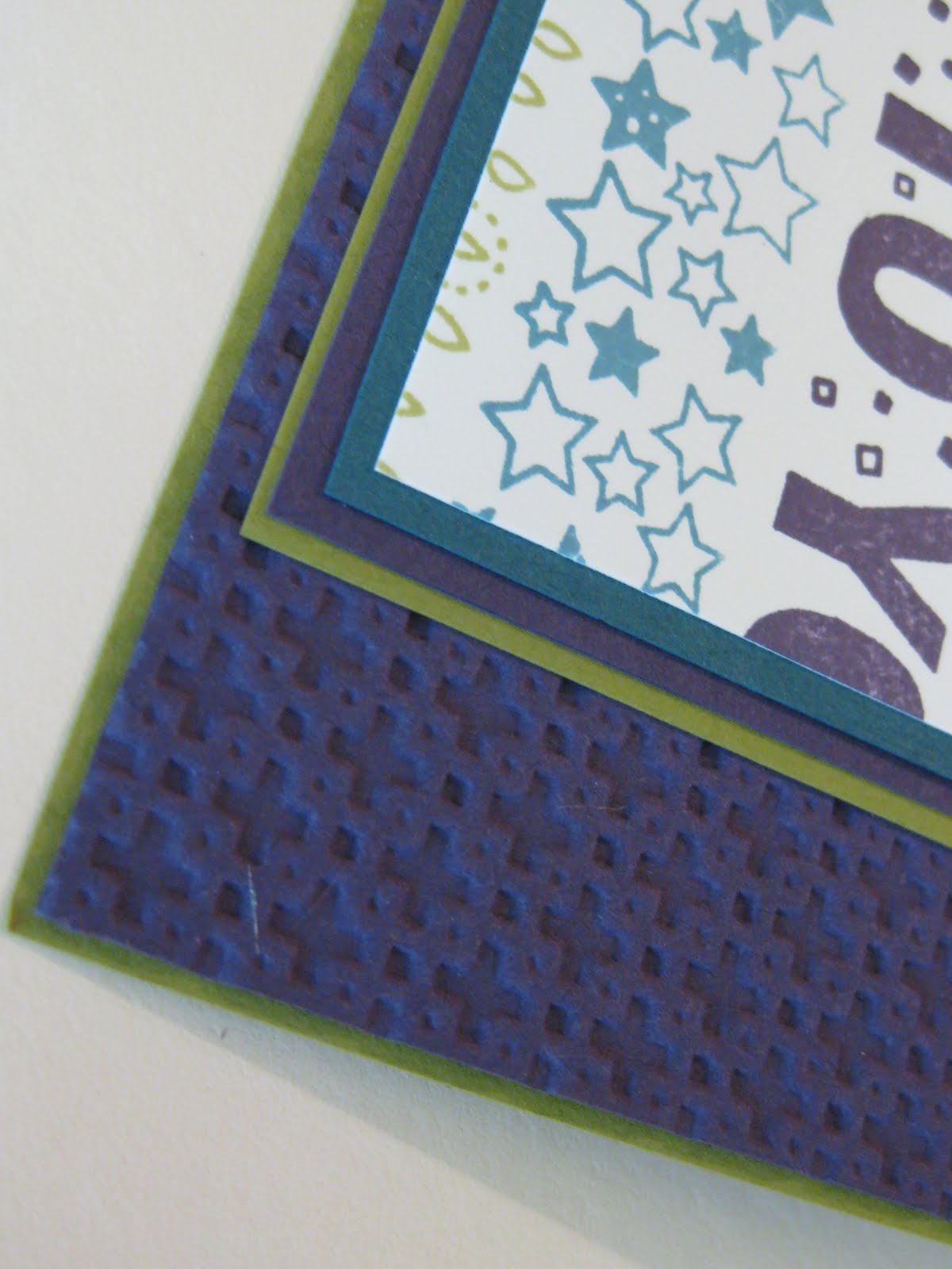
This first swap uses the Square Lattice embossing folder for the background layer, just like my "Mystery Image" post from yesterday. With Not Quite Navy, Elegant Eggplant and Old Olive loaded in the ink cartridge, I wheeled the "Birthday," "So Many Stars" and "Candle Crazy" wheels over full sheets of cardstock and then cut the sheets to size. After wrapping a piece of 5/8" Old Olive grosgrain ribbon around the wheeled layer, I added a sentiment from the "On Your Birthday" set that is punched out with the wide oval punch, and then backed with another wide oval punch of Elegant Eggplant. It's probably hard to see, but after punching out the eggplant ovals, I ran them through the embossing folder, and then when I layered them, I shifted the oval so that it is really only showing on the right side. On the left side of the sentiment, I inserted a silver Star Designer Brad, but then promptly covered it up with a punch-out made with the new "Itty Bitty Bits" stamp set and coordinating punch. I didn't really want to cover up the silver star that is in the brad, but somehow I needed to add a little more color to the center to balance everything. (How's that for an "un-official-no-I-don't-have-a-design-degree/don't-have-the-foggiest-idea-why-it-should-be-this-way" reason!)


Since I really seem to like lots of flowers and cheery, girl-y colors, I was relatively pleased with how this more-masculine-themed card turned out.


In my post of the "You make me happy" pup, I used the side of the Square Lattice embossed sheet that showed the "plus" signs. For this swap I used the side that the name of the folder implies:


This side looks more like intertwined squares or a trellis. Kinda cool that one folder provides two looks!


The second of my swap designs also uses 2 of the new wheels, but in a brighter color scheme. The focal point of this card uses one of the new "ala carte" stamps called "Birthday Block" that is on p. 41 of the Summer Mini. I embossed that image by first stamping the block on my Versamark pad and then immediately going to my Tempting Turquoise Classic pad and finally to the paper. (Adding the Versamark to the stamp helps make the image a little more sticky and allows the clear embossing powder to stick.) After heat embossing, I used Real Red, Pumpkin Pie and So Saffron markers to color in "you," "happy," and the candle. Having the image embossed makes staying in the lines super-easy!


The base of this card is black, not that you can really tell that, and what I did was trim off a 1/2" strip of the front. The Pumpkin Pie grosgrain ribbon is adhered to the very edge of the front of the card, while the Tempting Turquoise and Real Red pieces are adhered to the back/inside edge.

The star embellishments are just cardstock punches with "black" brads holding the stacks together. I say "black," because I am always-and-forever out of black brads (while I have TONS of the 3 other colors that come in the Vintage brads set!) so I had to get creative. I have colored brads with my black Sharpie marker before, but for this swap I needed far too many to have the patience to do that, so I tried something new. I took some of my Rich Regals colored brads and pressed them into my black Staz-on pad to see how that would work. (I used a tweezers to prevent overly-messy fingers!) They looked good, but needed a while to dry--so if you're going to try this, allow extra time--overnight would be good.

Now--on to the next project: cleaning up from all this creating! Hope you have a good day!

Saturday, April 24, 2010

"Mystery Image" Challenge

I participate in a couple of online swap groups several times a year, and one of the groups issues a variety of different swap "assignments" and also, weekly challenges. My week itself is usually enough of a challenge (!!!) so it isn't often that I put myself on that roster, but a couple weeks ago, the challenge topic piqued my interest because the focal image was to be a "mystery image" that came to us in the mail. That sounded interesting, especially on a dreary day during "spring break" when it seemed that half the world was somewhere else using up all MY sun! So I signed myself up and waited for the mailman to show up.

When the envelope arrived, this cute little puppy spilled out and it was time for me to get creative. All I had to do was create one full card to send to my swap partner--I could do that!

I dove into my stash of preordered upcoming-Summer-Mini-Catalog items and decided to use the Square Lattice Embossing Folder as a background. Just looking at this pup can't do anything but make you happy, so I used a portion of one of the Boho Backgrounds stamps for the sentiment and had that peek through the lattice. After watercoloring the image, I glossed up the dog's tag and the daisy with Crystal Effects and added a sprinkle of Dazzling Diamonds glitter over the daisy for a little extra sparkle.

One thing that I learned about my first run with the lattice embossing folder (besides the fact that this thing is going to get used A LOT!) is that if you're going to both emboss and punch a piece of cardstock, you want to punch first. Because the process of embossing softens up the paper fibers, when you go to use your punch you will not get as crisp of a punch. If you look closely, my Word Window shape is a little fuzzy.

It was fun to "have" to do a little playing, and it was also fun to get the card from my partner later that week (below). There were several of us who signed up for this challenge, and although the colors used for the pup were similar in most of the designs, everything else about the cards was totally fun and unique.


Friday, April 23, 2010

New Color Excitement!

As most of you have heard by now, on July 1st we will all have some yummy, new colors to work with as Stampin' Up! introduces their new Color Collections. Color is such a huge part of Stampin' Up!, scrapbooking and card making, and SU! is updating their color palate to stay current with the latest trends in color and design. I'm rather excited about all of this and can't wait to get my hands on all the new stuff--but before I get too far ahead of myself, I wanted to put together a good explanation of all the details, because I've heard A LOT of variations on how all this is being interpreted.

In preparation for these new collections (which include 5 brand new colors and some of our favorite In Colors from the past), Stampin' Up! will be saying a fond farewell to some of the current colors on July 1st: Almost Amethyst, Apricot Appeal, Ballet Blue, Barely Banana, Blush Blossom, Bordering Blue, Brilliant Blue, Brocade Blue, Cameo Coral, Close to Cocoa, Creamy Caramel, Gable Green, Glorious Green, Going Gray, Green Galore, Handsome Hunter, Lavender Lace, Lovely Lilac, Mellow Moss, Only Orange, Orchid Opulence, Pale Plum, Pink Passion, Pixie Pink, Really Rust, Ruby Red, Sage Shadow, Summer Sun, Taken with Teal, YoYo Yellow.

As with all change, the loss of all these colors seems harsh at first, but I know we'll all love the new offerings once we start playing with them. All I have to do is recall how we were sometimes less-than-excited about some of the In Color offerings at first--and then were shrieking when their rein was over because they had become absolute favorites. But, that's not to say that there are definitely some reasons that you may want to make sure you have a supply of certain colors before they are gone. If you have a favorite, favorite, favorite color that will be leaving, you may want to make sure that you have a pack or two of cardstock, a full reinker, and maybe even a fresh marker, so you're all set before it's too late. Or, if you're like me, and "your" (the kids') school colors are ones that will be going away, check your supply so you'll have what you need to make announcements, invitations or thank you cards. Contact me to let me know what you need, or visit my online store to stock up.

OK - so enough already--on to the specifics of all the new stuff! Our current 4 color families will be updated and called "collections." There will be ten main "core" colors in each of the four Color Collections.

There will be 5 new colors: Daffodil Delight, Early Espresso, Cajun Craze, Cherry Cobbler and Marina Mist-- and 10 Returning In Colors: Baja Breeze, Melon Mambo, Pacific Point, Rich Razzleberry, River Rock, Riding Hood Red, Pink Pirouette, Soft Suede, Tangerine Tango and Wild Wasabi.

The Brights Collection will include Regal Rose, Melon Mambo, Rich Razzleberry, Pacific Point, Tempting Turquoise, Old Olive, Daffodil Delight, Pumpkin Pie, Tangerine Tango, and Real Red.

The Neutrals Collection will include River Rock, Chocolate Chip, Soft Suede, Early Espresso, Crumb Cake (formerly Kraft), Sahara Sand, Very Vanilla, Whisper White, Basic Gray, and Basic Black.

The Regals Collection will include Elegant Eggplant, Night of Navy, Not Quite Navy, Always Artichoke, Garden Green, More Mustard, Cajun Craze, Riding Hood Red, Cherry Cobbler, and Bravo Burgundy.

The Subtles Collection will include Pink Pirouette, Pretty in Pink, Rose Red, Perfect Plum, Marina Mist, Bashful Blue, Baja Breeze, Wild Wasabi, Certainly Celery, and So Saffron.

The In-Color concept will continue, but with some change for the better! Stampin Up! will introduce 5 new In-Colors with the 2010/2011 Idea Book & Catalog on July 1st. (Watch for a sneak peak in June.) These new In-Colors will be available for 2 years! But wait, there's more! Then for 2011/12, another 5 new In-Colors will be introduced for a total of 10 In-Colors! The following year, the 2010/11 bunch will retire and a new set will be introduced! AWESOME.... RIGHT? Once a set of 5 is introduced, we get to play with those for 2 years instead of just one.

To help all of us update our supplies with these new colors, there will be NEW Color Kits for Stampin' Write Markers, Stampin' Pastels and Watercolor Wonder Crayons. This way you can add to your already existing collection by only adding the new colors! Plus - there will be an awesome NEW Color Coach tool that you'll find even more useful than the current one!

Gotta run now, but I'll be back soon. Contrary to my (lack of) activity here in "blogland," I've been anything but asleep! I finally pushed a bunch of swaps for the upcoming Summer Mini Catalog out the door, may be recovered from the marathon stamp camp last weekend, and I have yet another craft room IKEA-update to show you--but today's the last sunny day for a few, so I'm out to take care of the "colors" in the yard instead of the craft room! See ya later!
Blog Widget by LinkWithin